
The traditional website structure was built for businesses, not buyers.
The About page talks about you.
The Services page lists features.
The Contact page waits for motivation that never comes.
But real people do not move like that.
In 2026, buyers scroll, scan, and decide emotionally first.
They want clarity, proof, and direction. Fast.
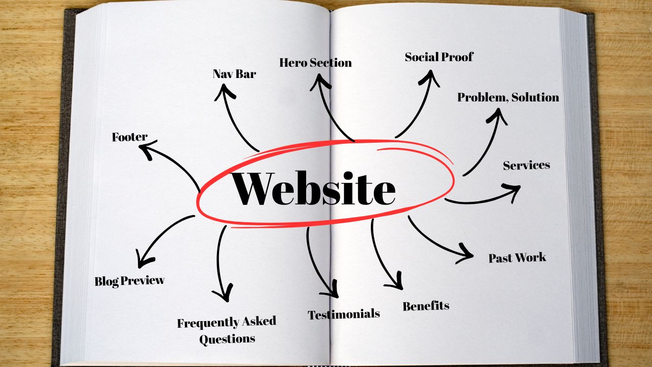
That is why high-converting service websites now follow a single long-scroll structure that guides visitors step by step.
Think of your website as a conversation, not a brochure.
Below is the exact order and purpose of each section.
Where the decision to stay or leave is made
This is the most important part of your website.
Your hero section is not a welcome message.
It is not a mission statement.
It is not a place to say “We are passionate about…”
Its only job is to answer three things immediately:
What do you help with?
Who is it for?
What should I do next?
One clear headline that speaks to a real problem or outcome
One short supporting line for clarity
One main call to action button
A simple visual showing the result, not just your face
Example idea:
Get a website that brings clients, not confusion
For service businesses that want steady inquiries without chasing people
Book a free strategy call
In 2026, clarity beats creativity every time.
ALSO READ: Why Is My Website Not Showing Up on Google?
Because trust must come before explanation
Most websites hide social proof too far down.
That is a mistake.
People do not trust websites.
They trust other people.
This section should appear very early on the page.
Google star rating
Number of clients served
Short credibility statements
Logos of businesses you have worked with
You are answering a silent question here:
“Have people like me trusted you before?”
If the answer is yes, they keep scrolling.
This replaces the About page
In 2026, the About page is not where trust starts.
Understanding the client is.
This section should talk directly about the visitor’s problem.
The problem
Call out the real issue they are facing.
The impact
Explain what that problem is costing them in lost leads, time, or money.
The solution
Position your service as the clear fix.
For example, a bad website is not just ugly.
It loses clients quietly every week.
This section works because people feel understood.
When someone feels understood, trust follows.
Not features
Most service pages list what they do.
High-converting pages show what changes.
In 2026, people do not buy services.
They buy results.
Each service card should answer one question clearly.
“What will this do for my business?”
Instead of:
Website design
Use:
A website that turns visitors into inquiries
Keep it simple.
Keep it focused on outcomes.
Proof that you can deliver
This section removes doubt.
Screenshots alone are not enough.
Context matters.
Before and after
What problem existed
What changed after
One clear result if possible
This shows that you do not just design or build.
You solve real problems.
Why choose you and not someone cheaper
This is where positioning happens.
Many service providers look the same on the surface.
This section explains the difference.
Clear communication
Strategy before design
Long-term support
Faster turnaround
Visibility and SEO thinking
Benefits answer the question buyers rarely ask out loud.
“Why should I trust you with my business?”
Short, specific, and believable
Long testimonials rarely get read.
In 2026, short and specific testimonials work best.
Client name
Business name
One clear result or experience
Specific testimonials build belief.
Generic praise gets ignored.
Where hesitation disappears
Most visitors do not leave because they are not interested.
They leave because they are unsure.
The FAQ section removes fear.
How long does it take?
What is included?
How do we start?
What happens after launch?
Place this section just before your final call to action.
Authority and SEO in one place
Your blog is not decoration.
In 2026, blogs still matter because they:
Build authority
Answer questions
Support SEO
Drive traffic to service pages
Show a few recent or popular posts.
Keep it clean and relevant.
Always end with direction
Never end a page without telling visitors what to do next.
Your final CTA should be clear and easy:
Book a call
Send a message
Request a quote
Your footer should include:
Contact details
Location
Social links
Trust information
The footer is not dead space.
It reinforces credibility.
Most service inquiries now come from phones.
If your layout does not work on mobile, nothing else matters.
Make sure:
Buttons are easy to tap
Text is easy to read
Sections flow naturally when scrolling
Mobile experience directly affects conversions and search rankings.